Canadian Centres for Regenerative Therapy
Industry
What We Did
Brand Identity, Website Design & Development, Copywriting, Photography, Digital Design
Making advanced medicine feel clear, credible and current.
Canadian Centres for Regenerative Therapy is a Toronto-based clinic focused on regenerative and translational medicine.
The challenge was to create a brand that could communicate medical expertise and scientific credibility without feeling overly clinical, dated or difficult to understand.
Project note
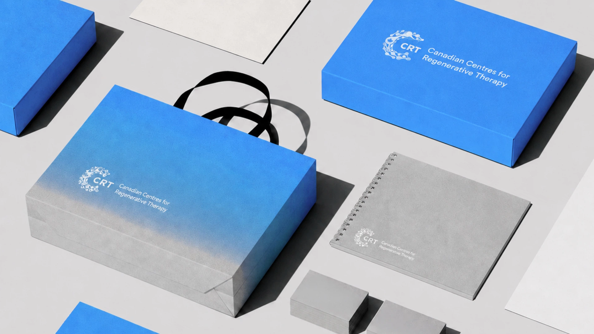
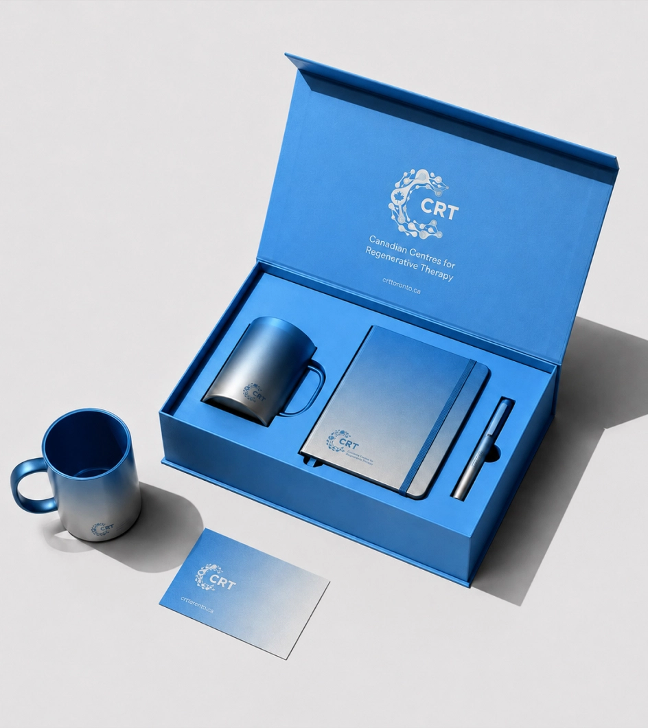
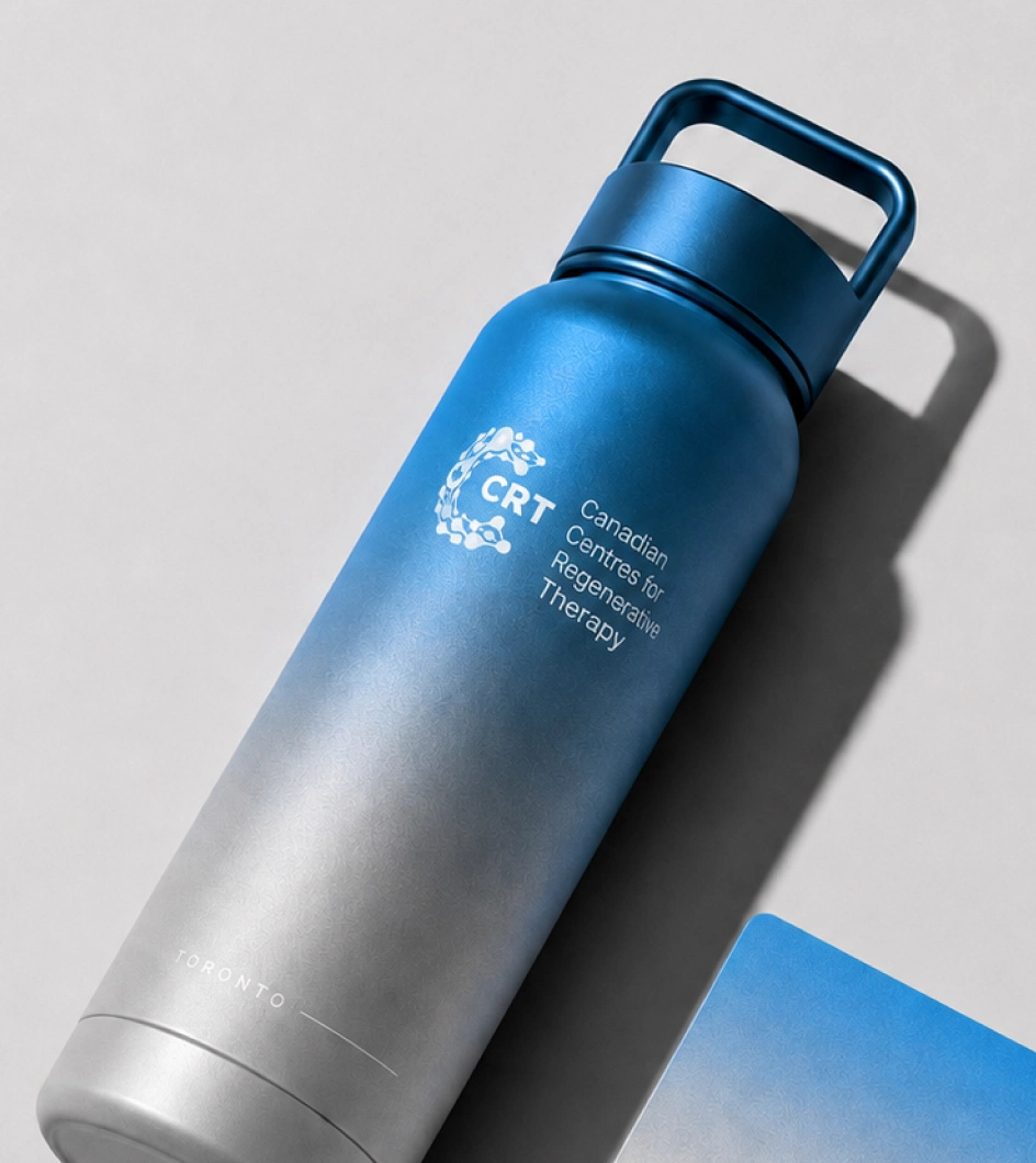
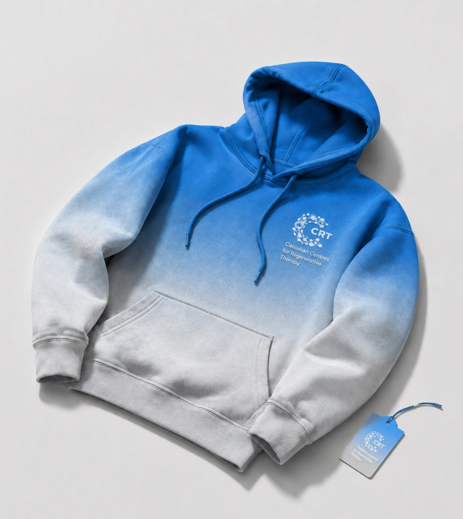
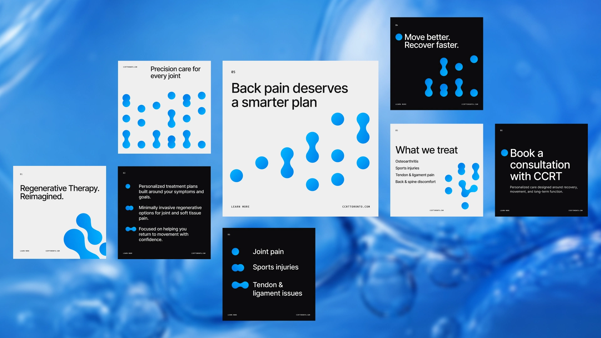
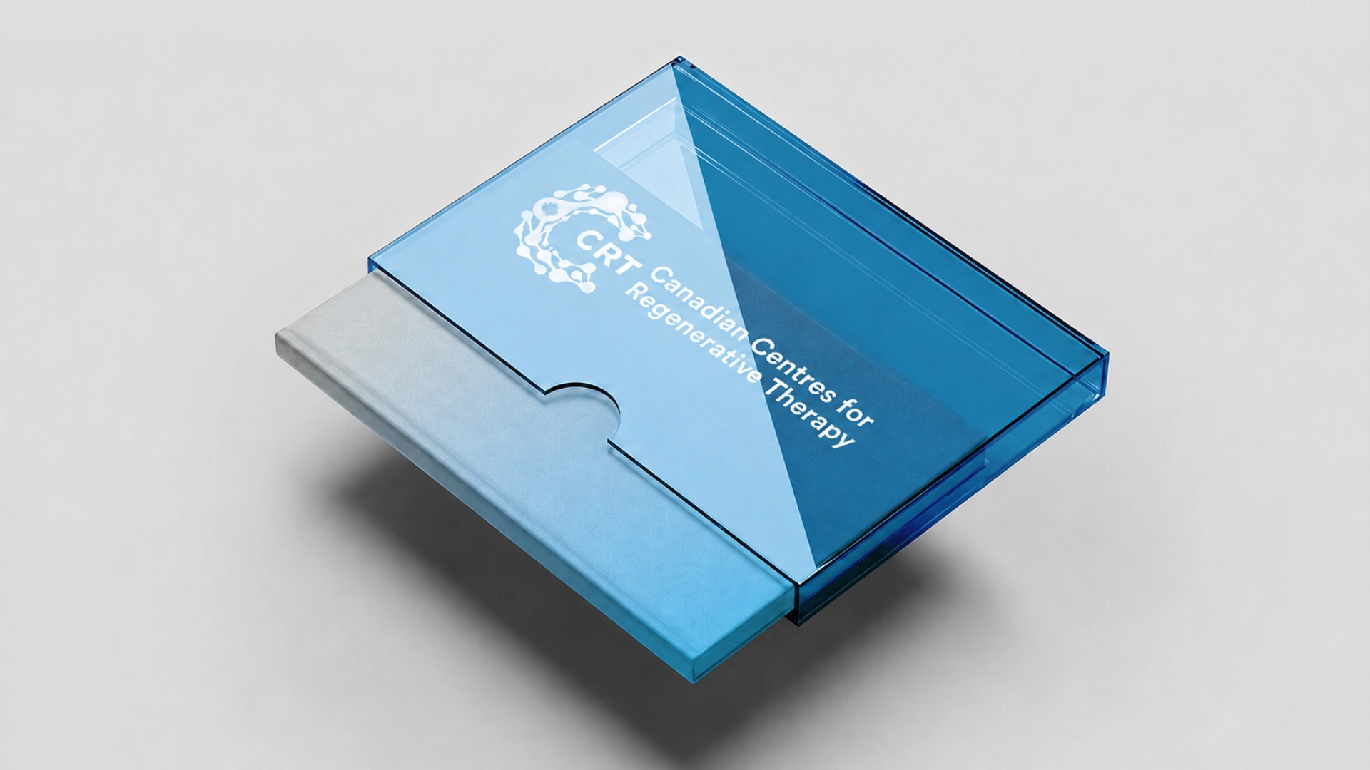
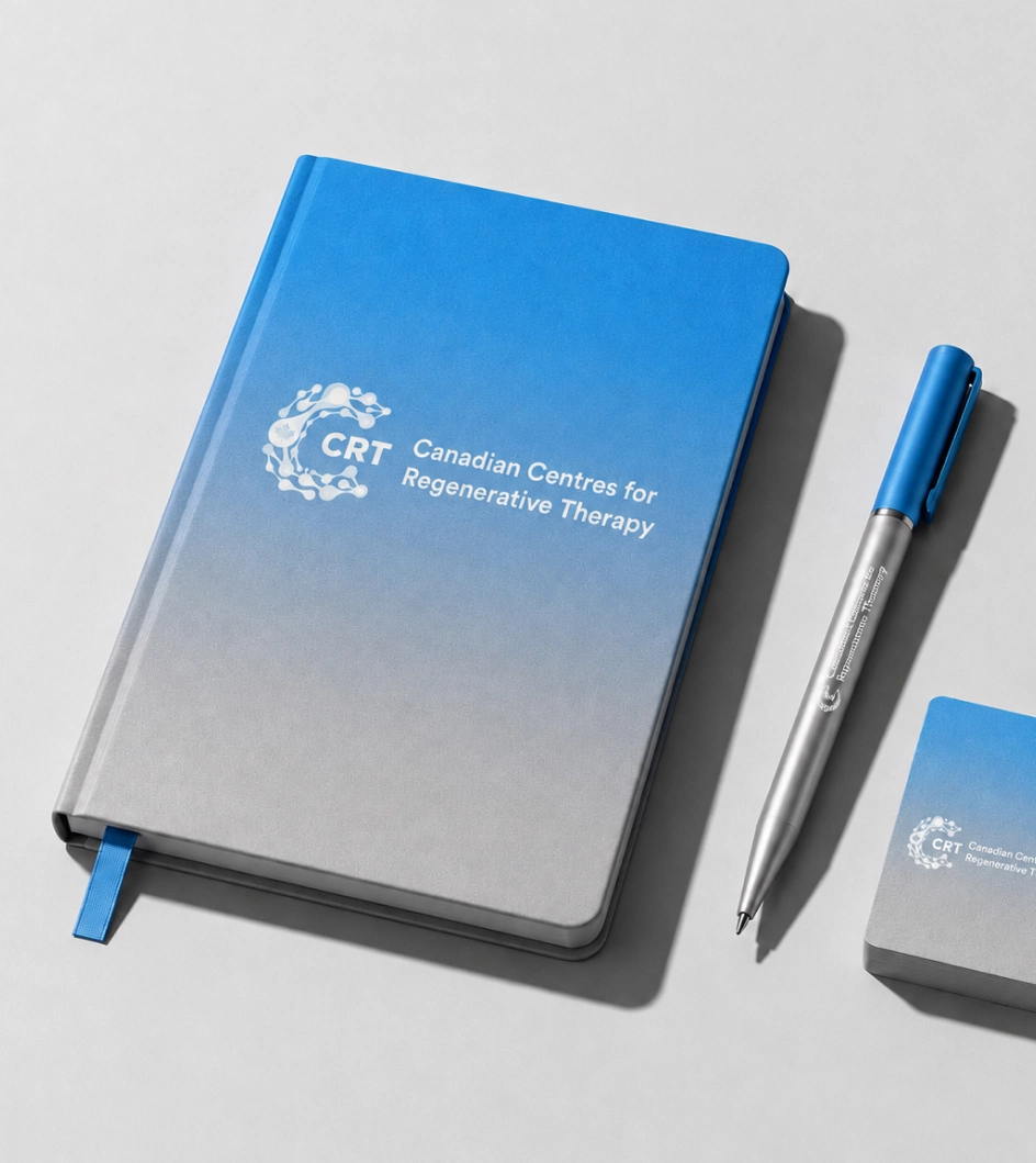
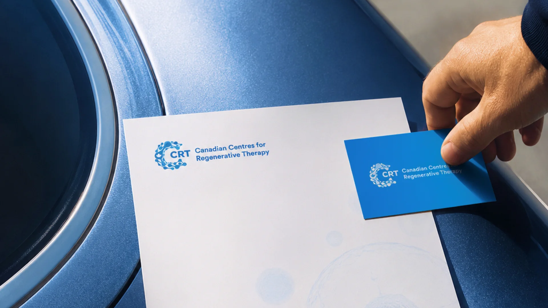
The identity, website, content and original photography were created for CCRT. Some of the additional applications shown here were developed later by Gazizoff to demonstrate how the original identity could extend across a broader range of touchpoints.
A scientific brand that still feels human.
We started by creating the visual identity.
The goal was to find the right balance: credible enough for a medical and scientific organization, but modern and approachable enough for patients encountering the clinic for the first time.
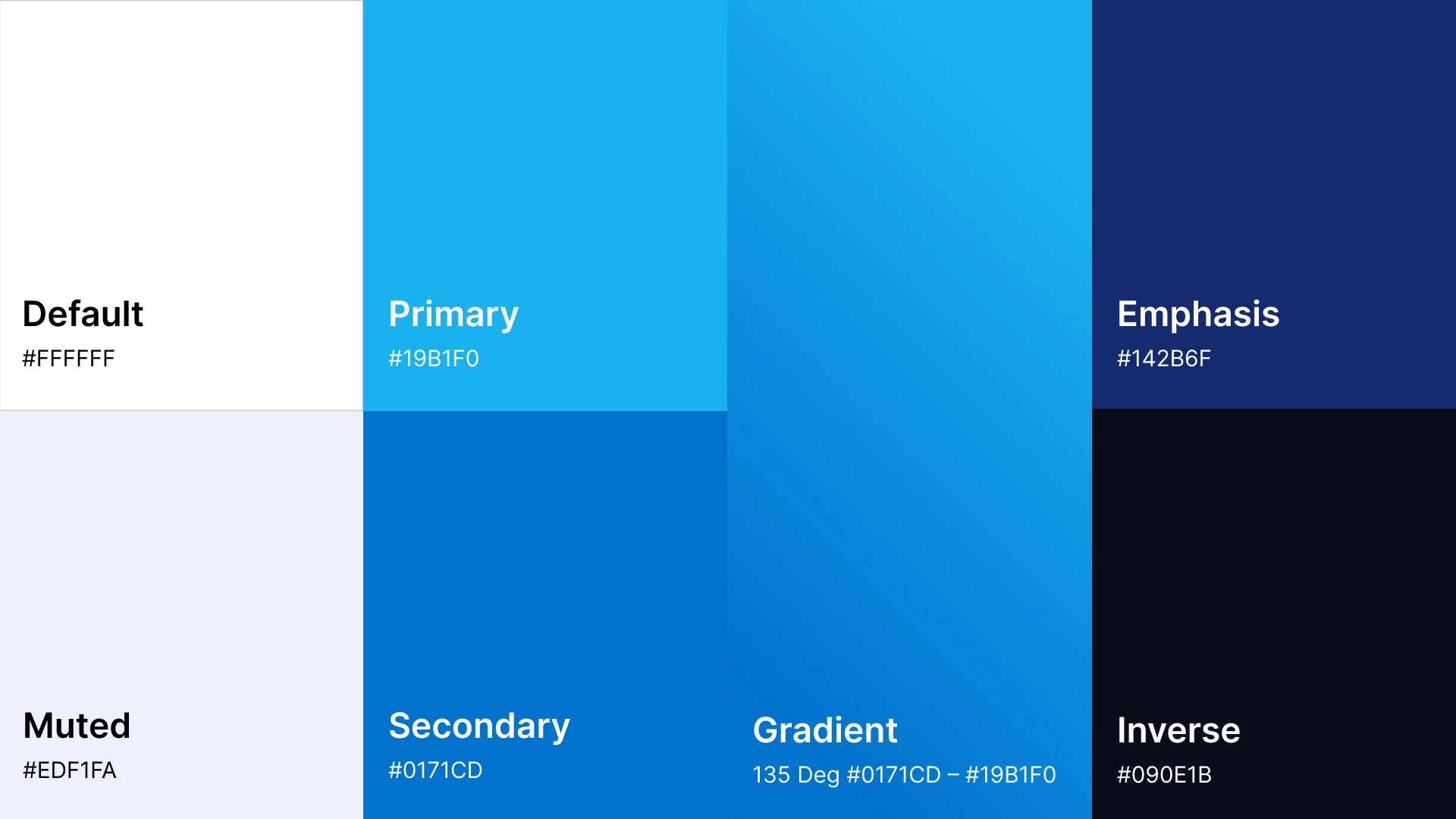
The identity was built around a restrained visual language, strong typography and a clean, contemporary aesthetic designed to give CCRT a distinct presence without relying on short-lived healthcare trends.
From identity to a working brand.
The project developed in stages.
After establishing the identity, we extended it into business cards and other essential brand applications before bringing the same visual language into the clinic's website.
This helped turn the logo into something more useful: a consistent foundation that could guide how the clinic looked and communicated across different formats.
The core identity created during that work remains in use years later.
Helping people understand why the clinic matters.
The website wasn't designed simply to list treatments.
We worked on the structure and copy to help prospective patients understand what CCRT does, the expertise behind the clinic and why its approach may be relevant to them.
That meant giving complex services enough context to build confidence without making the experience unnecessarily complicated.
We developed service content, supporting messaging and leadership copy—including the founder's biography—to create a more complete picture of the people, knowledge and experience behind the clinic.
Credibility starts with the people behind the brand.
Healthcare is personal, even when the subject matter is highly technical.
Alongside the website and identity work, we photographed the clinic's founder to give the brand a more credible and human presence across its digital communication.
Rather than relying entirely on generic medical imagery, the original photography helped connect the organization to the people actually behind it.
Designed as a system, not a single application.
The website brought the identity, content, imagery, typography and interface together into one consistent experience.
Reusable layouts, iconography and visual patterns gave different services and pages a common language while still allowing the content to change.
The result was a brand that could move naturally from a business card to a detailed medical website without feeling like separate pieces created at different times.
Built to stay relevant.
CCRT was one of our earlier healthcare identity projects, but the principles behind it remain the same today.
Rather than designing around what was fashionable at the time, we focused on clarity, restraint and a visual language appropriate to the subject.
Years later, the original identity still feels contemporary—and continues to provide a strong foundation for the brand.