The Toronto Clinic

Industry

Executive Healthcare

What We Did

Visual System, Art Direction, Website Design, Copywriting, Custom Imagery, Marketing Design

Bringing the standard of the clinic to every touchpoint.

The Toronto Clinic provides personalized executive healthcare for people who want a more proactive approach to their health. Its model brings assessment, prevention, ongoing care and specialized services together around each patient.

The experience was premium and highly considered. Its digital presence needed to communicate that just as clearly.

The foundations were there. The system wasn’t.

The Toronto Clinic already had a recognizable identity, including its logo and elements of its messaging. Rather than replace what was working, we focused on building around it.

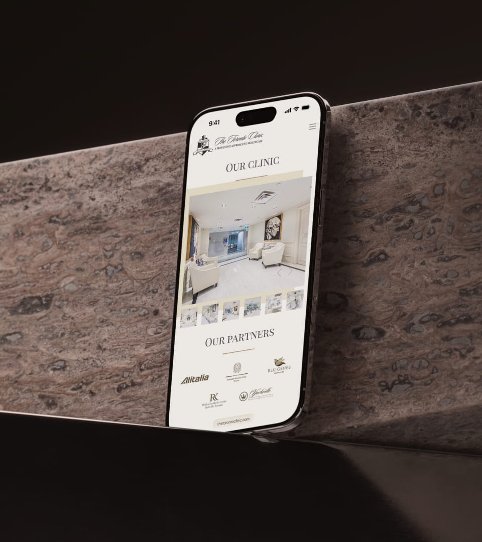
The existing website had become dated, while marketing materials lacked a consistent visual language that could easily extend across different services and formats.

Our job was to turn the existing brand into a more complete communication system—and give the clinic a digital presence that better reflected the quality of the business behind it.

Built to communicate, not just look good.

We developed a broader visual language around the existing identity, creating rules and reusable elements that could work consistently across the website, service communications, documents, advertising and future marketing materials.

That included a flexible icon system, custom imagery, photography direction, layouts and repeatable design patterns.

The goal was simple: make producing new communication easier without having to redesign the brand every time.

Making complex care easier to understand.

Executive healthcare can become complicated quickly. Different assessments, specialists, treatments and services all need to make sense to someone who may be seeing them for the first time.

We reworked and expanded the website copy, organized the information around the questions prospective patients actually need answered, and created a clearer hierarchy between the clinic's broader care model and its individual services.

The website was designed around conversion, but clarity came first: what The Toronto Clinic does, who it is for, why its approach is different and what someone should do next.


One visual world. Many services.

A clinic offering everything from executive health assessments to diagnostics, sports medicine and other specialized care needs a large amount of visual content.

We developed a flexible library of photography and custom service imagery that could make individual services immediately recognizable while still feeling like part of the same brand.

Rather than relying on generic healthcare imagery, the visual direction was created to feel more editorial, considered and appropriate for the audience The Toronto Clinic serves.

Designed beyond the website.

The system was extended across marketing and communication materials, including documents, service graphics and billboard applications.

Each format could change without changing the brand.

That gave The Toronto Clinic a visual framework broad enough for day-to-day communication, campaigns and new services while maintaining one recognizable identity.

A brand that can keep moving.

The result wasn't a new logo or a one-off website redesign.

It was a more complete system around an existing brand: clearer communication, a stronger digital experience, a broader visual language and reusable tools that make future marketing easier to create and easier to keep consistent.