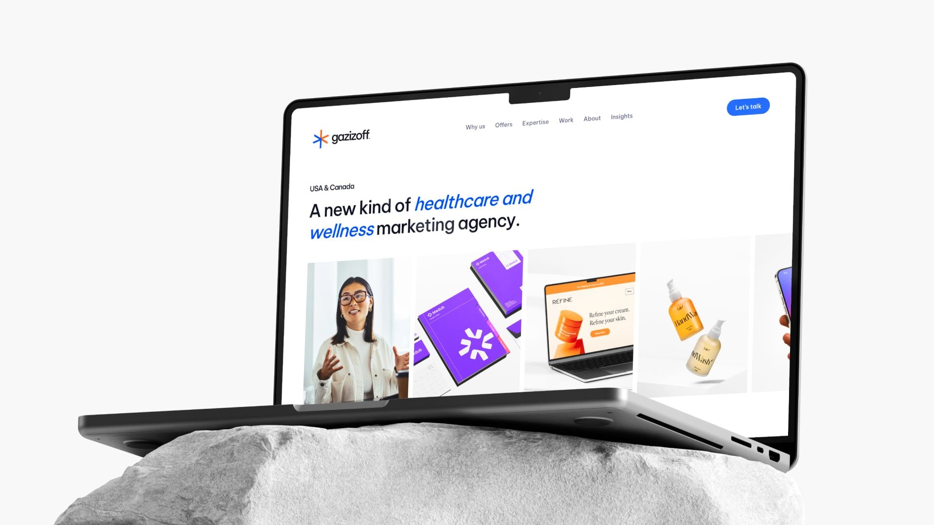
We are excited to announce that Gazizoff Digital has officially rebranded to simply Gazizoff.
This change reflects our commitment to innovation and our specialized focus on the healthcare industry.
A New Focus, A New Look
A year ago, we pivoted our focus to healthcare marketing, but our branding didn’t reflect this shift—until now. We’ve embraced a new visual identity that aligns with our mission and values.
Introducing Our New Logo
Our new logo features a medical star, symbolizing our dedication to the healthcare sector. The logo is composed of two arrows, representing growth and progress.
It’s designed to be more legible and instantly recognizable.
Updated Colors and Styles
We’ve refreshed our branded blue to make it brighter and more vibrant. Additionally, we’ve introduced a new color—orange—that adds energy and warmth to our brand palette.
Our fonts and overall design style have also been enhanced for better legibility and aesthetic appeal.
A Comprehensive Design System
Our rebranding isn’t just about a new logo and colors. We’ve developed a complete design system that covers all our visual needs, from social media posts and website pages to articles and even books.
This cohesive approach ensures that every piece of content we create is consistent and professional.
Reflecting Who We Are
The new styling represents who we are and what we do better. We’re not just a marketing agency; we are a modern, creative, and performance-driven company.
Our new look is beautiful, memorable, and perfectly aligns with our innovative spirit.
Looking Ahead
This rebrand marks an exciting new chapter for Gazizoff. We’re committed to continuing our journey of growth and excellence in healthcare marketing, with a fresh, modern look that truly represents us.
Thank you for being a part of our journey. We can’t wait to show you what’s next!
We hope you enjoy our new look as much as we do. Stay tuned for more updates and exciting projects from Gazizoff!


Leave a Reply